 |
|
 |
British Colours 1747-1815,
History and Appearance (2)
Problems in
Reconstructing Historical British Colours Three ways
British colours are misrepresented Why? The "Standard
References" on British Colours |
 |
So What’s the
Problem? There are three
ways in which British colours of the period 1747-1815 (an arbitrary
cut-off date based on end of the American War of 1812 and the
Napoleonic Wars in Europe) are routinely
misrepresented: 1) The central designs
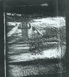
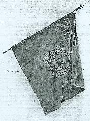
are drawn far too large in proportion to the whole flag. Left: original colour, 9th Regt of Foot. Although
this flag has been reassembled from mere rags of the original, note
that embroidered wreath is only about 1/4 size of British union
in corner. Note also that white
fimbriations to central cross are much wider than depicted in
drawing on right, and nearly as wide as the corner-to-corner
cross of St Andrew. From Gherardi Davis, Regimental
Colors in the War of the Revolution, 1907.
Right: Davis's drawing of same
colour, in same book. |
 |
2) The colours are drawn,
particularly the King's colours, with the white
fimbriation—the white strips that separate the red cross of St
George from the blue field of the flag, far too narrow, and often
as not, the white corner-to-corner cross of St Andrew far too wide,
both of which give the colours a very different
appearance from their actual appearance in life. These
mistakes are compounded by the fact that most colours 1772 through
the 1780’s were made with just the opposite attributes: their white
fimbriations were wider, and the St Andrew’s cross
narrower, than per regulation. 3) The central designs are
drawn so freely as to give the impression that there was little
regularity among the regiments. In fact there were standardized
designs, almost certainly associated with individual makers, which
account for by far the largest number of colours that survive from
the period, suggesting that those colours which have not survived,
would nevertheless have been very much like those that have. |
 |
Why? Simply put, the "standard"
references are wrong, or at least misleading. Samuel Milne Milne’s
Standards and Colours of the Army has been the
standard reference on British colours since its publication in
1893. Milne’s desire to adequately portray the salient points of
art and design in British colours, however, led him to draw
the designs on the flags much larger than they would appear in
life. This would be akin to doing uniform plates with buttons,
lace, or belt plates at twice their natural size; it might
better show the details of these uniform parts, but it could also
lead to paintings, posters, second-generation book illustrations,
movies, and re-enactors sporting uniforms with three-inch buttons
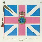
and lace, and belt plates the size of typing paper. Left: Milne's Plate of the King's colour of the 2d
Battalion of the 1st, or Royal Regiment, c. 1747. Milne
purposely drew the central device larger than life.
Right: Same colour made according to Napier's scale
drawing. Flags that have survived follow the standard pattern
to a fairly high degree. |
 |
While Milne clearly stated his
purpose in the introduction to his book, apparently very few have
bothered to read it. British colours have been drawn ever
since with their central motifs far too large in relation to other
parts of the overall design. In book after book, the central Union
Wreath is shown spilling far out over the white fimbriation of the
central cross on the King’s colour, or filling virtually the entire
field of regimentals. Milne’s drawings might also be faulted for
ignoring accurate proportions between the crosses and the white
fimbriation on the colors, another mistake common to most later
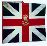
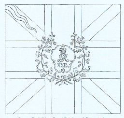
depictions. Right: Milne's drawing of King's colour, 2d
Battalion, 20th Foot, 1800. The gold flame, or "pile wavy" descending from
the upper staff corner indicated the Second Battalion of any
regiment. |
 |
The very best of the old works is
Andrew Ross Old Scottish Regimental Colours, published in
1885. The plates are uniformly excellent and appear to
have been made from photographs. Unfortunately it is
not well known, and where some of the flags in it were
later re-drawn in Milne's Standards and Colours, it
has been Milne's out-of -proportion pictures that have obviously
been relied on by later illustrators. Regimental
Colors in the War of the Revolution, published in 1907 by American historian Gherardi Davis,
gives information on British colours, illustrated with
photographs and drawings of three that were actually carried in
America. But describing specifics of pattern or design among the
colours Davis dismisses as "probably… impossible, and in any
event not especially interesting." Davis also left
several fine water-colors that have been widely published in
The American Heritage histories of the Revolution. Overall,
Davis shows too few British colours to draw generalizations, and
perhaps following Milne, some of his drawings show the component
parts of the colours out of proportion. Edward
Richardson’s Standards and Colors of the American
Revolution, 1982, while giving much useful information on
American and French colors, is simply wrong in almost every respect
when it comes to the British. Dino Lemonofides, British Infantry
Colours, 1972, has acccurate text, but Milne-style
out-of-proportion drawings. The very handsome new
British Colours and Standards 1747-1881, by Ian Sumner and
Richard Hook, in the "Osprey Elite" series, includes most of the
same mistakes as other books on the topic. |
|
|